Google Play Store “My Apps & Games” Section Receives Revamp
Google Play Store “My Apps & Games” Section Receives Rework
If you have not noticed yet, Google released an update that revamped the Google Play stores “My Apps & Games” section. The UI is now a lot more cleaner and simplified while showing more detailed information.

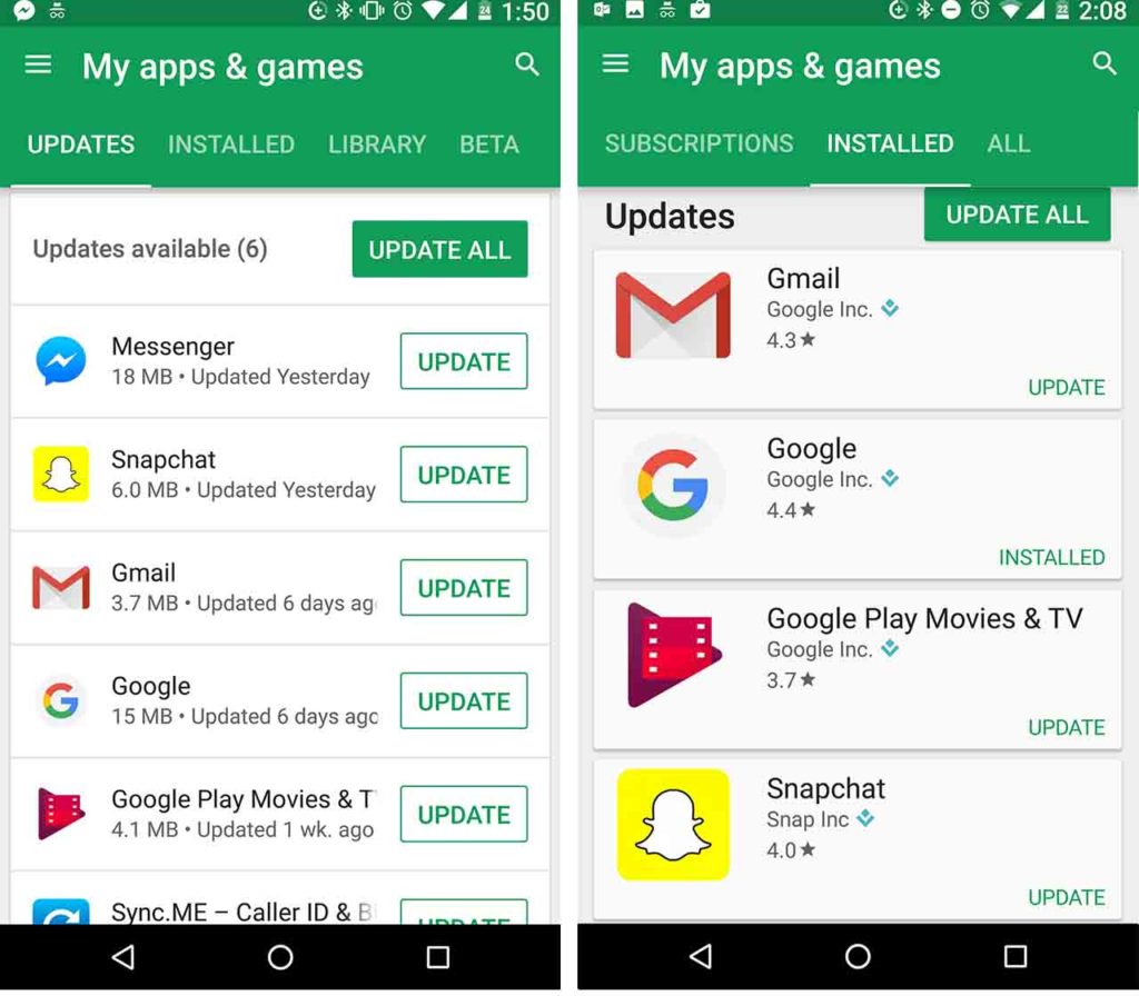
Each line or card is now thinner so users can see more of the applications up front. The Update All function remains but now an Update function button is available beside each app to simplify matters. This change now enables users to skip having to click on the app in order to individually update the app.
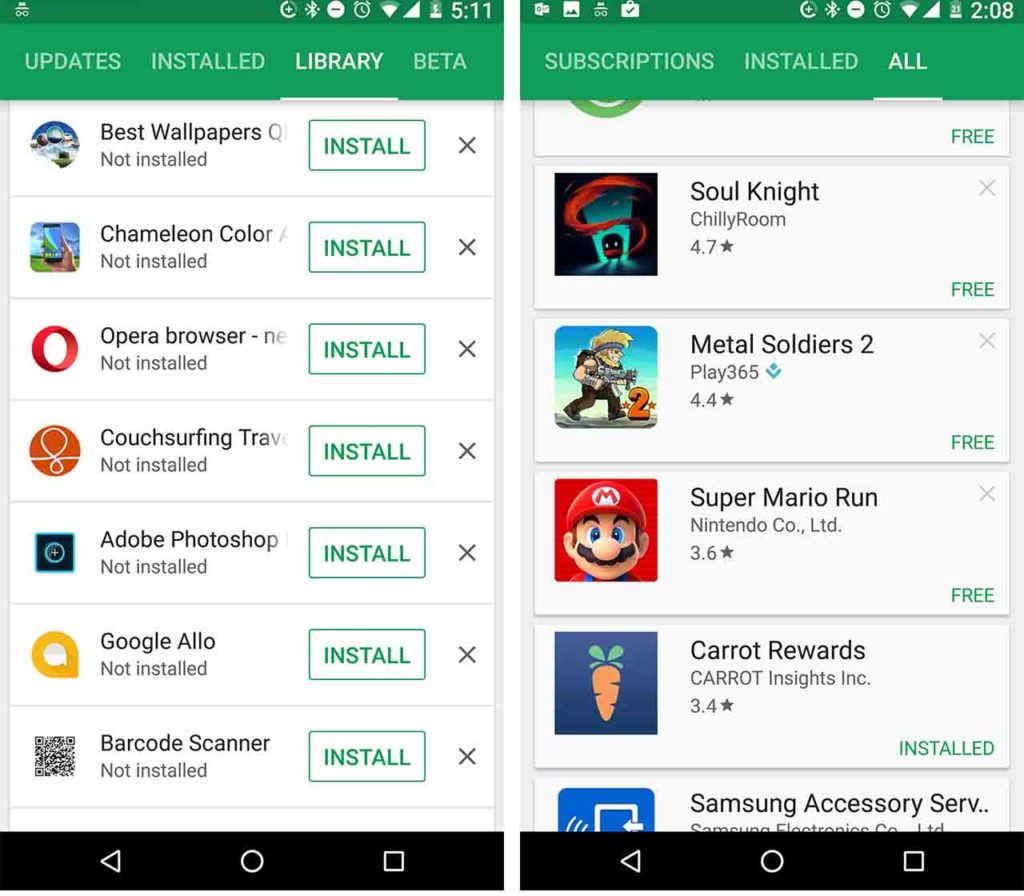
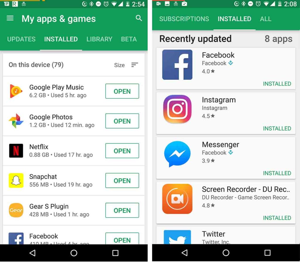
The latest version of the Play Store has a better system of organisation for the apps contained. Apps are categorized into four different sect ions: apps that require updates, apps already installed, apps associated with the user and then there are beta apps.
The Beta Apps section will not be shown if you have not downloaded and installed any beta apps.

The update tab remains even if all apps are up to date. Beside each app on the cards show when the apps last got updated. This can please many users as it is a positive step towards a more transparent updating process. Installed apps can now also be automatically rearranged alphabetically, by date, by last used time frame, and by the size of the app.

Overall the new update enables an easier access to already downloaded apps. The My Apps & Games section has a lot more utility now.


